Upon reviewing the source code, I immediately began looking around for breakable objects.
And here's why.
Bad HTML
<div id="header">
<div id="header_container">
<div id="home"><a href="index.php">Home</a></div>
<div id="facebook"><a target="_blank" href="https://www.facebook.com/musicnowentertainment">Facebook</a></div>
<div id="youtube"><a href="mailto:[email protected]">[email protected]</a></div>
<...more bad code...>
Bad CSS
#facebook {
	position: absolute;
	top: 88px;
	left: 905px;
	width: 27px;
	height: 28px;
}
#facebook a {
	display: block;
	text-indent: -9999px;
	width: 100%;
	height: 100%;
}
#youtube {
	position: absolute;
	top: 87px;
	left: 949px;
	width: 29px;
	height: 28px;
}
#youtube a {
	display: block;
	text-indent: -9999px;
	width: 100%;
	height: 100%;
}
Notice there're no images? Oh. That's because the #header has everything in one giant graphic.
#header {
	position: relative;
	background: url(../images/Layout_Header.jpg) no-repeat center top;
	height: 421px;
}
That's right. All the links are placed as invisible containers above a header graphic with the text moved out of view.
How about we do this the non-n00b way.
Better HTML (remove unnecessary elements, add icon class)
<a class="home" href="/">Home</a>
<a class="youtube icon" href="//www.youtube.com/musicnowent " target="_blank">Youtube</a>
<a class="facebook icon" href="//www.facebook.com/musicnowentertainment" target="_blank">Facebook</a>
<a class="mail icon" href="mailto:[email protected]">[email protected]</a>
Because DRY.
New CSS
.icon { position: absolute; height: 32px; width: 32px; display: block; top: 88px; overflow: hidden; }
.facebook.icon { left: 850px; }
.youtube.icon { left: 902px; }
.youtube.icon img { margin-left: -64px; }
.mail.icon { left: 954px; }
.mail.icon img { margin-left: -32px; }
It's okay if the above CSS attracts you sexually a little bit.
Even better HTML (use images and alt instead of text)
<a class="home" href="/"><img src="images/logo.png" alt="home" /></a>
<a class="youtube icon" href="//www.youtube.com/musicnowent " target="_blank"><img src="images/icons/youtube.png" alt="Youtube" /></a>
<a class="facebook icon" href="//www.facebook.com/musicnowentertainment" target="_blank"><img src="images/icons/facebook.png" alt="Facebook" /></a>
<a class="mail icon" href="mailto:[email protected]"><img src="images/icons/mail.png" alt="[email protected]" /></a>
Why? Because Google hates -9999px text-indent you spammer! And what about when we have 235235 x 1204124 pixel monitors? That text isn't actually gone. It's floating somewhere off the edge.
Even more better HTML (use image sprites)
<a class="home" href="/"><img src="images/logo.png" alt="home" /></a>
<a class="youtube icon" href="//www.youtube.com/musicnowent " target="_blank"><img src="images/icons.png" alt="Youtube" /></a>
<a class="facebook icon" href="//www.facebook.com/musicnowentertainment" target="_blank"><img src="images/icons.png" alt="Facebook" /></a>
<a class="mail icon" href="mailto:[email protected]"><img src="images/icons.png" alt="[email protected]" /></a>
Why? This cuts down on HTTP requests for each image. Instead, we use a single image with the icons laid out in a grid. Then we adjust the visibility using negative margins.
Here's what a sprite graphic looks like:
(I added a black background so the mail icon is visible)
Here's the cleaned up header graphic:
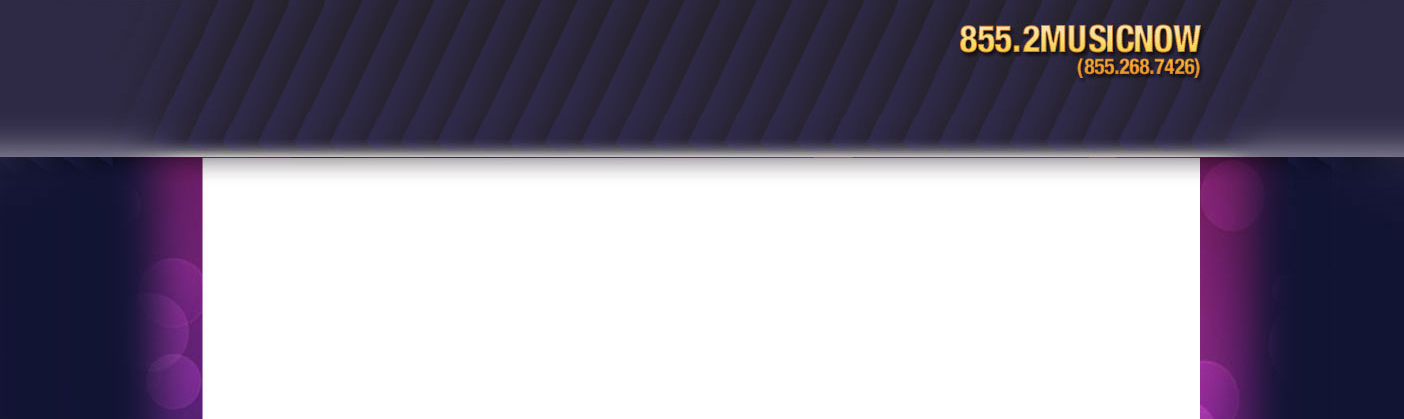
And here's the final "clean" product

Other cool stuff that I'm going to tease you with but not tell you how to do (yet?):
- With the sprite method it's extremely easy to add rollover effects (with css) and animation (using the spritely jQuery plugin)
- Using a single image for your icons makes it super easy to change icon themes without touching a character of code!
- Using a common icon class makes changing sizes and positions laughably simple. Haha. Done.
This post is only meant to quickly provide an example.
If you have any questions, please ask!